Problem
The existing vendor marketing platform exemplified what happens when engineering priorities drive UX instead of user needs. The existing experience was a messy, fragmented journey where user consistently hit unexpected walls and basic tasks felt unnecessarily difficult. The interface was cluttered with irrelevant features, unfocused on important tasks, and the post-purchase experience abandoned users precisely when they needed maximum support. It was a perfect example of "we built what we could build" rather than "we built what users needed.”
Results
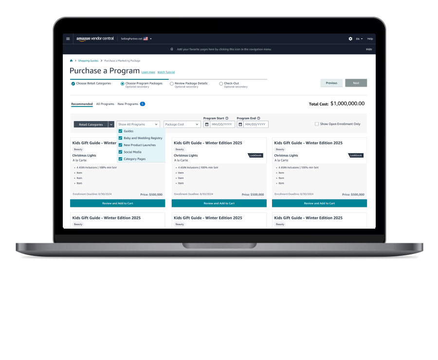
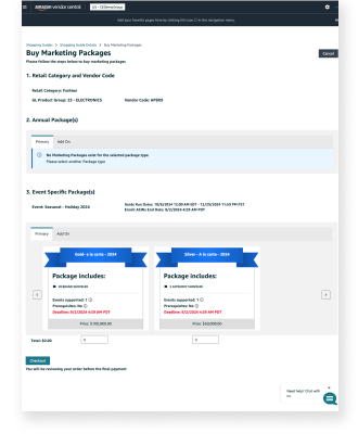
What initially was a simple ui refresh resulted in a complete redesign of the vendor experience. Onboarding and management where separated into two distinct workflows, and a new dashboard important status updates on their promotions to prompt them to address issues what would delay their purchase from going live.


No Comments.